Friday, October 1, 2010

Translating from Canvas to 12x12

I had a blast working with canvas during our Lucky 13 Journey and created some pages that really challenged me creatively. Some of us made copies of our canvas pages to keep a second book for ourselves. Why not translate the canvas pages into 12x12 pages?

One of my favorite pages is the one I created for Elena Etcheverrry--the rich, bright blue with the white and brown accents really pops of the page for an intense effect. I took this page that I created for Elena:


And simply did the same exact thing on a 12x12 piece of cardstock that was the same blue.


The blue on Elena's page is actually painted. I taught this "copy" in my Project 12x12 Class on Going Green--we used some Martha Stewart Felt Doilies in a new way! They came 3 to a pack and who needs 3 in their house--use one for decor and the other 2 for craft projects, why not?

Just because art is on canvas or presented in a different way than our familiar scrappy 12x12 scrapbook pages doesn't mean we can't translate that to our own work! Next time you're feeling a little stumped about where to go with your page, look outside of scrapbooking for inspiration--translate a piece of art into your own scrapbook page.

Happy Creating!!

Saturday, August 21, 2010

Lucky 13 Publishing Update


I wanted to share with you an update on the Lucky 13 project. Recently I received a sneak peek and some information about when and where the Lucky 13 project was going to be published. Now, if you're not familar with the Lucky 13 . . . no worries . . . check out the blog and I think you'll find it a lot of fun. It was 13 artists that Elena Etcheverry brought together from all over the world to share in one anothers lives. We crafted each others special moments of life each month. It was a very special journey that brought new friendship and strengthened others not to mention the inspiration that took place. All kinds of media was used and our main ingredient . . . it was done on canvas.

So the project will be published in Somerset Memories in their Autumn issue which is due out on October 1st. Because there were so many images . . . there will be a sampling in the article and then more images will be available on line.

I wanted to personally thank Jana . . . the fantastic editor of Somerset Memories for all her hard work on this issue and project. She's fantastic! I wanted to thank everyone who came along this journey with us! It's been a very special one!

Thursday, May 6, 2010

Last of the Last and Wrapping It Up

I realized I didn't post the last page I created which was for Gloria. I created the following page for Gloria. I enjoyed using paint (fabric and 3-D) as well as paper and ink. Just a mix of different things. But I wanted to share it with you and also give you a little update.


I'm completing an article and compiling all the finished Lucky 13 projects in preparation for publication in Somerset Memories. I'll keep you updated as to when the publication is available.

Everyone has their pages in hand from each artist and have bound them together some way, some how. It's been fun to see each of them. Donna and I found a fun basket in which I'll store the books in while they are at Stampington's headquarters.
There's a part of me that has enjoyed having a completed project in hand that represents our lives and our art. There's also a part that's kind of sad to see this journey come to a close. But I know the relationships made through this project will be long lasting!

Sunday, March 21, 2010

Some Pages from Melissa

Being on the other side of the world and hearing how these girls are catching up with one another at crops and things around the country at times made me feel a little removed from the group but it was a great year getting to know them all through the blog, email and then of course there is CHA where twice a year we actually do get a chance to meet face to face. All these girls have a wonderful way of making you feel welcome. All so friendly and warm and extremely talented. It was an honour to be asked to take part and also lots of fun. Scrapping on canvas was a whole new experience for me and i slowly got more confidence to try new things as the year went on. Here are a few of my pages that I did for the girls.

Page for Gloria.
I love happy snaps especially with chidren and i know how much Gloria's children make her happy. I had a little fun playing with one of our new ranges on this page. Even the stamps worked on canvas which was something i hadn't done before.

Page for Cheryl
Glimmer misting seems to be all the current rage at the moment so when i got to Cheryls page as she is sooooo creative i thought i too would try something a little different and outside of my usual comfort zone. I got one of my grandma old doilies (don't worry it wasn't an antique one) and layed it over my canvas and used it as a mask when spraying.

Page for Elena
We all know how special Elena is and well this girl inspires me, how she is always doing something for someone. Even with out the makeup, without the trademake princess crown truly is NATURALLY beautiful inside and out. As her favourite colour is purple that is the colour i based this layout around. I loved doing this page for her.

Page for Jane This is another layout that i had a lot of fun with and overdosed a little with the glimmer mist.
Its hard to see from the sneak peak but i was inspired by the photograph of the gorgeous wreath of leaves so out came the leaf punches, a couple of visits to LSS's to find more and to create a wreath of my own to showcase the photos in.

stay tuned for more later on - but i think the kids and hubby need a feed first.


Saturday, March 13, 2010

Cheryl's Page by Angela

Well, really this is Cheryl's beautiful daughter Abby's page. Cheryl treated Abby and her friends to a day at Knott's Berry Farm for Abby's birthday and I got to try my hand at being challenged by the concept of a birthday once again. But again, because I love Cheryl, it was easy PLUS I'm always raving about Cheryl's wonderful work and all the fun little details she adds, so I immediately knew I wanted to make sure I went a little crazy with this page.
First, I am a huge candy fan. Everyone jokes that I should do crafts with candy but this is the furthest I've ever taken the challenge. I painted the whole canvas page with Liquitex Texture Gel with glass beads and then sprinkled real cake sprinkles on top. I was going for a frosted cake look and it worked! The only thing I'd change next time is adding some paint colors to the clear texture gel so you really see the texture of the "frosting." And for all of you who were taught to scrap in the days of "acid free" warnings, I give you permission to branch out. This layout will not last forever and the cake toppings will probably not fair to well in the long haul (I could spray them with a sealant, though) but the most important thing is, I had fun making it. Plus, I have photos of the layout that will last forever.

Donna's page by Angela

This whole Lucky 13 exercise has been so interesting. How do you take photos that you aren't really invested in and create a page around them? That's a challenge. However, it becomes less of a challenge if you know the person in the photo well. Take Donna, for example, I've known her for years now. We worked together on the Scrapbook LifeStyle show but we also had time to know each other outside of work. Turns out we both love thrift stores and divey food places. I also know that Donna has a special affection for all things denim . It wasn't too much of a stretch to think about how to scrap for Donna. I just grabbed a ripped and outgrown pair of my son's jeans and went to town.

The best thing about these Blank Canvas Board books by C & T Publishing (plug!) is that they really inspire me to get out the sewing machine. I revived an old piece of silk embroidery ribbon I had to add some detail to these plastic Heidi Grace flowers I used as well. I also used a home decorating tip on this layout: when in doubt, add a small splash of red here and there. It helps brighten up monochromatic color schemes.

Friday, March 12, 2010

Michelle's May page by Angela

I have an affliction I refer to as FReDs: Facial Recognition Disorder. This means that I have a hard time recognizing people if they change ever so slightly from one meeting to the next or even if they've changed their hair (ponytail v. hair down will render people completely unrecognizable to me) or, even worse, if they're in a new venue. Even if you're my dentist of 10 years, I won't know who you are if you approach me at a soccer game. I'm totally self-diagnosed, of course but this all leads me to this layout I made for Michelle. It looks like she's with Kelly Gorey from BasicGrey. I mean, I THINK it's Kelly...

At any rate, this is a very ME layout- no influencing by the other Luckies. I like bold colors and I really love plastic. I know that's not chic or today but I do. I am using up my last bit of cherished grapefruit bag netting for this layout. I can only hope Costco sells those again because I love the material. I also have a fondness for polyester but I suppose that's beside the point...

Another Easter Page- for Melissa by Angela

Holidays are tough for me to scrap. I look at the photos and all I can think is, "Yep, another cake." or in the case of Easter at our house- it's usually just uninspiring shots of my family, with bedhead and some not so great shots of our kids stumbling around in the backyard on a sugar high. I'm just not inspired by them. I prefer to scrap moments than events. However, I have been SO inspired by the gorgeous pages my fellow Lucky 13ies have made (the cute Easter page Nan made for ME below, for example), I have been determined to continue to scrap outside the parameters of my usual clean graphic look. So when Melissa sent me photos of her girls at Easter, I immediately thought of my favorite part of Easter- the sugared eggs that you can peek through and see a little scene inside. I think they're simply magical so why not make a scrapped version?


This idea took 2 canvas pages instead of the usual 1. It also meant I had to brave the semi-treacherous world of German glitter glass (I'm always afraid I'll forget I have it all over the place and rub my eyes!) but you know, I think I actually pulled off the idea I was going for. I even found a good reason to add one of my favorite embellishments- tulle and even did a bit of sewing. I wish I could show more than a peek because I think it's pretty darned cute but you get the idea. And just in time for THIS Easter! Cheers, Melissa!

Thursday, March 11, 2010

A Page for Donna from Melanie

Donna's smile always makes me happy... she's so cheerful all the time! She taught a class at Scrapbook Royalty's Royal Slumber Crop last March, and I still had a flower in my stash from her class! Hey, recycling is in now right? ;) I got inspired and put some small canvas frames on her page... I put the photos she sent me on those canvases!


Monday, March 1, 2010

A Page for Angela by Nan


I really enjoyed making this Easter-themed page for Angela. It was raining cats and dogs here in California, and it made me long for the warmth and color of springtime Easter! Isn't this picture of the egg so cute and green (my fave color!) For this page, I used lots of bright color - it is Easter after all. I sponged paint onto the acrylic alpha, and sprayed the canvas with various inks. I had this paper duckie from Prima for ages - and it got good use here. Nothing compares to Angela's two adorable little angels in the picture - no doubt loving their Easter morning goodies.

Hope you like, Angela!

Thursday, February 25, 2010

A Page for Gloria from Melanie

Gloria sent me a photo of her and her beautiful family from a wedding they all went to in the summer... I tried to keep it simple and classic to stay with the theme of the photo. Gloria nicknamed me the "elegant" scrapper... hope I lived up to her expectations! ;)


Thursday, February 18, 2010

A Page for Stephanie by Melanie

Who doesn't love to ring in the new year... Stephanie sent me these great photos from her celebrations! Party hats, noise makers and all... I had this small December calendar that was just waiting for the right layout, and this was it!


Saturday, February 13, 2010

a Page for Donna by Jennifer


This page was in my head for a few months until I could sit down and figure out how to execute it--Donna sent me these awesome underwater photos of her daughter in a swimming pool and I just kept thinking "mermaid" every time I looked at them!

Donna is really an "artist" and I knew I wanted to do something really cool for her page -- there is NO paper on this page at all and I am a "scrapbooker at heart" I like to say. This whole Lucky 13 process has really challenged me to get out of my box, try new things, and push my own creative envelope.


When you're a ribbon collector like me sometimes it is hard to part with your stash (even if you have an obscene amount of ribbon like me!) but this page was all about ribbon. Last year I did a class using Glimmer Mist where I created a beach page featuring ribbons I twisted to look like kelp and I knew that look would be perfect for these photos. Easy to do on paper, not easy to attach to canvas. Glue dots (my best friend) and canvas really aren't friends so I had to sew the ribbon to the page.


After the "kelp" was on I added Prima e-Line Pearls that I colored with Copic Markers to look like bubbles in the water. The Thickers and My Little Shoebox letters are attached with Aleene's No Sew Fabric Glue - again, with canvas some things just don't want to stick as well as I would like ;) The beaded leaves are a little secret from my stash...

When I showed Donna her page she gasped and I knew she loved it ;) That is such an awesome feeling--putting a lot of thought and love into a design and having the person who receives it be just so delighted to see it. I'm still smiling from showing her her page ;)


-----Jennifer

Tuesday, February 9, 2010

A Page for Cheryl From Melanie

Wherever Cheryl goes, she is always ready for a hug or two... She is the Mama Bear of the group! She sent me some great pics from when she and the other lead Fiskateers went to the Brains On Fire headquarters. The turquoise flower is made of baking clay - I usually make rings out of this stuff, but thought I could make a small one to fit on Cheryl's page!


Saturday, February 6, 2010

A Page for Jennifer from Melanie

Jennifer and I have had a chance to share pages... and when we did, we realized we both used the same paper line on each other's layouts!! Great minds. ;) Jennifer sent me some great photos with some vintage cars and her cute kids, so the colourful pages were perfect!


Monday, February 1, 2010

a Page for Cheryl by Jennifer


Cheryl rocks. I mean, is there another way to describe her? Sweet, vibrant, reliable, crafty, talented, faithful ... one of the cool things about doing this Lucky 13 Circle Journal is getting to know each other better and becoming friends. Or getting to know your friends better.

ANYWAYS, when I got Cheryl's photo from her trip up to Dutch Flat to one of Miss Vicky's FAB-U-LOUS retreats, this photo of she and Elena dressing up and posing just caught my eye. Look at that crazy deep teal color on the back wall of the room they are in! I painted my canvas that color and then just started pulling colors from the pic to pull items from my stash...orange from Elena's shirt, red from the flower on Cheryl's hat in the pic, black from an umbrella that Cheryl is holding...
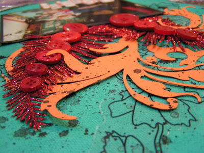

The way I have organized my scrap room has really changed how I scrap--everything is by color. For this page I just opened up the drawers for the colors in the photo and pulled out whatever seemed to fit the feel of the photo. The buttons were already on my scrap table from a kit club kit I was designing some samples for; it was a happy accident that the feathers got pushed under the buttons when I laid my goodies out and I though "ooh, that might be interesting...". Sometimes having a cluttered table is a good thing ;) The glitter "feathers" are from Michael's in the Christmas picks section--I always find the coolest stuff in there!
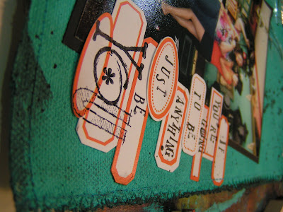

I splattered black paint all over the page too--even if you're not an artist this is a really easy technique to do. Go somewhere you can get messy, like outside, and water down some black paint. I like to do this when my paint bottles get close to being empty becuase it is really hard to get that last bit of paint out so I fill the bottle with water, maybe 1/4 to 1/2 of the way full, then put the cap on and shake it. Then I squirt a little of the watered down paint on a foam paint brush (again, doesn't have to be a fancy brush). To get the splatters I knock the brush downward toward the page but hit the handle of it against my other arm or my hand so when the brush gets "knocked" the splatters head downward toward the photo. If you want the splatters to look old, blot them with a paper towel before they dry, soaking up excess paint and water, like I did on this page (you can really see it on the orange paper diecut on the page).

Cheryl has her page now and I hope she loves it ;) I had a really fun time creating it!!

------Jennifer

Saturday, January 30, 2010

A Page For Jane by Melanie

I got a picture from Jane from when she reunited with her cousin... Both with beautiful smiles.
I had fun putting some different elements on this page, some of them quite heavy! So much so that I had to reinforce the back of the canvas! ;)


Thursday, January 28, 2010

a page for jolee jane by candice

two small sneak peeks of jane's page.


you can read about the inspiration by visiting my blog.

Monday, January 25, 2010

Page for Melissa by Nan


LOVE the photos Melissa sent for her layout! They are all photos of HER taking pictures! Isn't that cool? I also totally dug using the patterned burlap fabric from Prima as accents and as background. This was a fun layout to do, because the photos "say it all" which are the best kinds of photos, I think. And, the texture of the burlap with the canvas...is just yummmmm. :)

Friday, January 22, 2010

a page for elena by candice

here's a page for elena. just sneak peeks for now. xo!


Page for Nan by Jennifer

When I think of Nan, I think of happy, smiling, cool under pressure, someone who brings light to the world and everything she does. I feel really blessed to be able to work with her through Zutter, here with the Lucky 13, and just as a great friend.


When Nan sent me photos of she and her daughters, the bright colors in the pics made me instantly think of the Maya Angelou quote:

Precious Jewel,
You Glow
You Shine,
Reflecting all the good things in the world.

-Maya Angelou

I wanted to use the bright colors from the photos, magenta and sunny yellow so I painted a background of yellow polka dots directly onto the canvas. What's more happy thank polka dots?!

To get the paint to flow more smoothly onto the rough canvas I watered it down to almost watercolor consistency. After the paint dried, I used a sewing machine to add a zigzag stitch around the edge and add swirls across the polka dots.

I then raided my button stash for my most favorite yellow buttons--I had been saving them for something special and once I laid them out on the page I knew I had to use them ALL. Okay, I kept one button for myself ;) I hand-stitched the buttons to the centers of the polka dots. I wanted Nan's pics to have a fun feel so I matted them on white cardstock to look like Polaroids. Then I added the quote, using the fonts Rockwell and Clementine -- you download them both for free at dafont.com.


I can only show you sneaks but this is one of my favorite Lucky 13 pages so far--so bright and cheery and simple. I hope Nan likes it ;)

Wednesday, January 20, 2010

page for Candice by Elena

Candice and I got to spend time together at CHA last Summer in the boiling sweaty heat of Orlando Florida. She helped with the Scrapbook Royalty chores and walked the floor with me a a bunch of volunteers and then slaved away with the rest of us at the charity crop. I have to say, she was amazing. And truly a Rock Star!

I used all the colors of the Rock Star can as my inspiration. Paint, glimmer mist, stuff and more stuff. It was a very fun page to do!