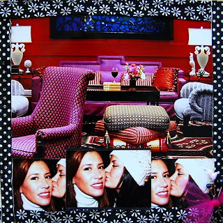
When Jane sent me this fabulous photo of the Hotel Monaco in Portland, Oregon and the gorgeous photos of her with her daughter, they all looked so... I don't know... so fashion forward. The circumstance of their trip tells a very different story but I just couldn't stop thinking about a fashion inspired page (Project Runway addict that I am) and the story boards that designers use. To tell the fashion story on the front side of the canvas, I dipped into my jar of black and white ribbons and used some of my favorites to create a fabric-like border for the photos and another black ribbon with an interesting border to highlight the middle photo of Jane and her daughter at the bottom of the layout. In keeping with that design board idea (and again trying so hard to get that fabulous textural look so many of my fellow "Luckies" excel at), I used pins and tulle for an accent.

Because I was thinking about fabric swatches (these little canvas books really do make me think more about sewing on layouts than I usually do) and because I was still concerned that Jane's story about her trip be told, I decided to use some of my favorite fabric swatches to make a very rustic pocket on the back of the layout. Jane can use this pocket to add memorabilia and journaling notes later and the pocket will still fit in with the designer board idea I began with on the front of the layout. One thing I love about scrapping is that a completely inept seamstress like me can pretend to be a bit of a fashion designer with a few scraps and fabric- a pocket of mine wouldn't hold up well to wear but for a little canvas book? I think it will do just fine.


Like you, the hotel lobby picture made me think of design, fabric, & texture. The ribbon frame was perfect for this layout as well as the tulle with the pins. They pulled it all together & conveyed the feel you were going after. Loved the pocket you made for the back too. Great layout!
ReplyDeleteso pretty!!
ReplyDeleteYou rocked this page Angela. .. very cool
ReplyDeleteAngela!
ReplyDeleteI so love what you created- I too am a Project runway Junkie!! I never noticed all the different fabrics and colors in the picture of the hotal lobby, you really brought them out and they POP! thanks so much for making such a wonderful page for me;)
OMG how awesome is this! Jane IS very fashion forward so I think you nailed this on the head.
ReplyDelete